









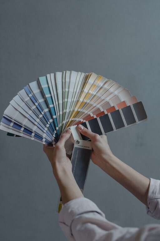
Creating a calm and soothing environment in your home is essential for relaxation and comfort. One of the most effective ways to achieve this is by choosing the right colors. Calm colors can transform any room into a peaceful retreat, helping to reduce stress and promote well-being. If you’re considering a fresh coat of paint or redesigning your space, this guide will help you pick the perfect calm colors for your home.
Why Choose Calm Colors?
Calm colors are typically soft, muted, and easy on the eyes. They help create a serene atmosphere and can make spaces feel more spacious and inviting. Unlike bold or bright colors, calm hues don’t overwhelm the senses, making them ideal for bedrooms, living rooms, and other areas where relaxation is the goal.
Understanding Color Psychology
Before selecting calm colors, it’s helpful to understand how colors influence mood:
– Blues: Often associated with tranquility and stability, blues are great for bedrooms and bathrooms.
– Greens: Represent nature and balance. Soft greens promote relaxation and refreshment.
– Neutrals: Shades like beige, ivory, and soft gray provide a clean, peaceful backdrop.
– Lavender and Soft Purples: These can evoke calmness and creativity.
– Warm Pastels: Light peach or blush tones add warmth without being overpowering.
Tips for Choosing Calm Colors
1. Start with a Color Palette
Choosing a color palette helps ensure that your colors work well together. You can start with a primary calm color and build complementary shades around it. Tools like online color palette generators or paint brand sample cards can be helpful.
2. Consider the Room’s Purpose
Think about how you use each room. Bedrooms benefit from softer, cooler tones like pale blue or sage green, which encourage rest. Living rooms might enjoy warm neutral tones, such as beige or light taupe, which create a welcoming atmosphere.
3. Test Samples in Your Space
Colors can look very different depending on the lighting in your home. Always test paint samples on your walls and observe them at different times of day. Natural and artificial light can influence how calm a color feels.
4. Use Matte or Satin Finishes
Glossy paint finishes tend to reflect more light, which can make colors feel brighter and less calming. Matte or satin finishes absorb light better, lending a softer, more soothing appearance.
5. Balance with Natural Elements
Pair your calm colors with natural materials like wood, stone, or plants. These elements enhance the peaceful ambiance and add texture and warmth.
6. Limit High-Contrast Colors
High contrast can create visual tension, so avoid pairing calm colors with very dark or bright shades in the same space. Instead, opt for subtle variations within the same color family.
7. Use Color Psychology to Your Advantage
For example, in a home office, a muted green might help improve focus without feeling overwhelming, while soft blue in a nursery promotes serenity and sleep.
8. Incorporate Accent Colors Carefully
If you enjoy a bit of color variation, use calm accent colors sparingly. Soft coral, dusty rose, or muted gold accents can provide interest without breaking the overall calm theme.
Popular Calm Color Choices
Here are some popular calm color options to consider:
– Pale Blue: Reminds of the sky, creates a feeling of openness.
– Sage Green: Earthy and relaxing, blends well with natural materials.
– Soft Gray: Neutral and versatile, gives a modern yet peaceful vibe.
– Warm Beige: Cozy and inviting, perfect for shared spaces.
– Lavender Gray: A hint of color that still remains subdued and tranquil.
Frequently Asked Questions
How do I know if a color is truly calm?
Calm colors usually have low saturation and are not too bright. They often resemble colors found in nature. If a color feels soothing rather than energizing, it’s likely a calm color.
Can I use calm colors in small rooms?
Yes! Calm colors can make small rooms feel larger and more open. Light shades particularly help in reflecting light, making the space seem airy.
Should I paint all rooms in calm colors?
Not necessarily. While calm colors work great in most rooms, you might want to use livelier colors in spaces like the kitchen or playroom to encourage energy and creativity.
Final Thoughts
Choosing calm colors for your home is a wonderful way to create a peaceful sanctuary where you can unwind and recharge. Take your time exploring shades, testing samples, and considering how each color makes you feel in different spaces. With these tips, you’ll be well on your way to crafting a tranquil, beautiful home you’ll love.
Remember, the goal is to find colors that bring you comfort and joy, turning your house into a true home. Happy decorating!